Think, manufacture, sell
PРР is not just produce and sell. In a more and more…
PРР is not just produce and sell. In a more and more…
Nowadays good visual merchandisers can create beautiful shop windows, but we believe that the knowledge of some simple rules can be of great help in the daily life of the store.
Below we intend to give you some advices that, in addition to your original ideas, we hope will make your work easier.
First of all, before you begin to realize your shop window of success, it’s necessary you have a clear idea of what is more important to emphasize and what is the message you want to convey.
You can opt for a commercial approach, with simple exposure of the products for sale, or for an artistic one, as a work of art designed to capture attention.
In both cases is important to keep a coherent line of the external window with the interior of the store, otherwise customers would be lost once inside.
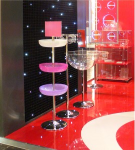 The signage must allow to quickly find the desidered department or, on the contrary, favor a path inside the store to see the other product categories.
The windows of monobrand shops are usually almost empty. Sobriety emphasizes brand and image. On the contrary those of shops smaller and with various brands and products, are usually full of references. Think about oriental shops, where windows and sales area are full of products with the “bazaar effect”. In conventional windows, it’s recommended noto to everdo it because exposure might result chaotic.
In the case of seasonal items (clothing, shoes), references to nature, holidays, traditions, are certainly useful to characterize a window in “line with the times”.
Price must be displayed for the products normally on sale, differentiating the presentation for special offers (as a percentage of discount or a crossed price), giving the perception that inside the store also other prices are discounted.
A good price holder surely gives an impression of order and clarity. The same can not be said about signs written in pen on pieces of cardboard.
As well as inclined or vertical label holders (universal), also some simple acrylic plates of large thickness, with the same size of the price tag or positioned above it, give a very attractive “lens” effect.
A new arrival is also the “sandwich” label holder, with large thickness acrylic sheets (8-10 mm), joint with magnet, inside which is placed the price tag.
A little trick: next to clothing, the addition of accessories (bags, belts, etc.) helps and advises customer to “total look”. It’s no longer necessary to go for shops, saving thus a lot of time.
Identify an area in the central part of the window, clearly visible from the outside (important: if possible, from the inside too), with the diametre of about one metre, at eye level, to be the “strong point” that contains the most prestigious item, the one that reflects the identity of the mark, of the shop.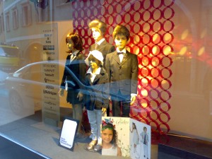
A pedestal, a bookrest, a set of dedicated spotlights, the frame of a picture, are just a few practical exemples of how to create this magnet for all bystanders.
Lighting is equally important to create plays of lights and shadows when night falls.
Nordic countries have always had a special sensitivity to make magic even the simplest shop window. Next to the technical choice (warm light, halogen lamps, leds etc.) it’s necessary to evaluate also the power consumption based on hours of light.
However lights must not be irritating, must not be pointed towards the outside (risk of dazzling), superimposed, crossed.
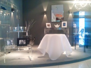 But above all they don’t have to change dramatically the exposed items colors. Obviously the focal point (see above) must receive a particularly refined and elegant lighting.
A “unique” shop window does not get unnoticed
The choice may be to exhibit the most polished items, or eye-catching decorative elements.
Large retailers prefere standardized windows, with modular elements but a unique presentation format.
In the wide range of displays on the market, material may be of help in special cases (wood, metal, cardboard, etc.) but certainly acryilic resin (plexiglas and similar), with its transparency and neutrality, is one of the most suitable materials to highlight the product.
Clearly stability, aesthetic features and implementation details must be of the first rank.
A display that is poor, crawled, flaky, does not encourage the purchase.
Color transmits many sensations to the observer.
To understand the force that a color can convey, just think about colortherapy, an alternative medicine of oriental origins which cures many diseases with colors.
Depending on the kind of window you want to have, you can use simple and timeless colors or innovative fluorescent and luminescent colors.
Experience shows that is better not to overdo it with background colors and choose, on the contrary, the transparency of plexiglas, that preserves the colors of displayed items.
Just a few hundred metres as the crow files, is the island of Torcello, very important as a natural “bridge” that led to the birth of Venice.
A visit to the museum is therefore recommended to understand the genesis of this extraordinary city. From 1966 to present were examined, almost annually, large sections, also extended for kilometres, of street Annia, of the way to Oderzo and of the connetting urban road with the latter.

These excavations unearthed more than 2.000 grave goods, many funeral monuments and above all enabled the acquisition of a unique
wealth of information about the roman funerary culture.
When this museum was opened there were a thousand objects, whereas now the consistency of the material amounts to about forty thousand pieces. The peculiarity that distinguishes it from other national venetian archaelogical museums, is the direct relationship with the vast surrounding archaelogical area.
Due to continuous flow of a huge amount of excavated material, it was necessary, over the years, to practice several enlargements of the museum deposits which led to transfer this new museum in the two rural buildings specially purchased by the State, inaugurated and opened to the public july 4, 2015.
In Altino our product is art 142, black color and it acts as an elegant false ceiling within the display cases.
It’s relatively small in size, therefore it’s not necessary to suspend it by some reduntant bracings.
You simply have to install it to obtain the desired surfaces using modules with snap fitting, choosing 400×400 mm or 200×200 panels. The trimming can be performed subsequently with a simple hacksaw. The operation ends resting it on the perimetre board.
Flatness is ensured by the grid structure and the lightness of the article. Pictures were taken with permission of the Italian Ministry of Cultural Heritage.
Fig.
As a concession from the Ministry of Cultural Heritage and Activities and Tourism. All rights reserved
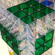 London based designer AndyMartin will present an ambitious new project in partnership with PPP, a Venetian based plastics product company, in the Brera Design District during the FuoriSalone 2012.
Gridspace is the exploration of the rigour of geometry and the transparency of plastic. It is the development of Andy’s fascination withmateriality and elemental constructions.With the inherent restrictions of a grid formAndy looks to find the emotion through the raw liquidmaterial of ABS and acrylic plastic in the transparency and colour. Here formplays a secondary role in delivering an object.
andy martin
7a wakefield street
london wc1n 1pg
t +44 (0)20 3397 1999
pr@andymartinstudio.com
Link:
